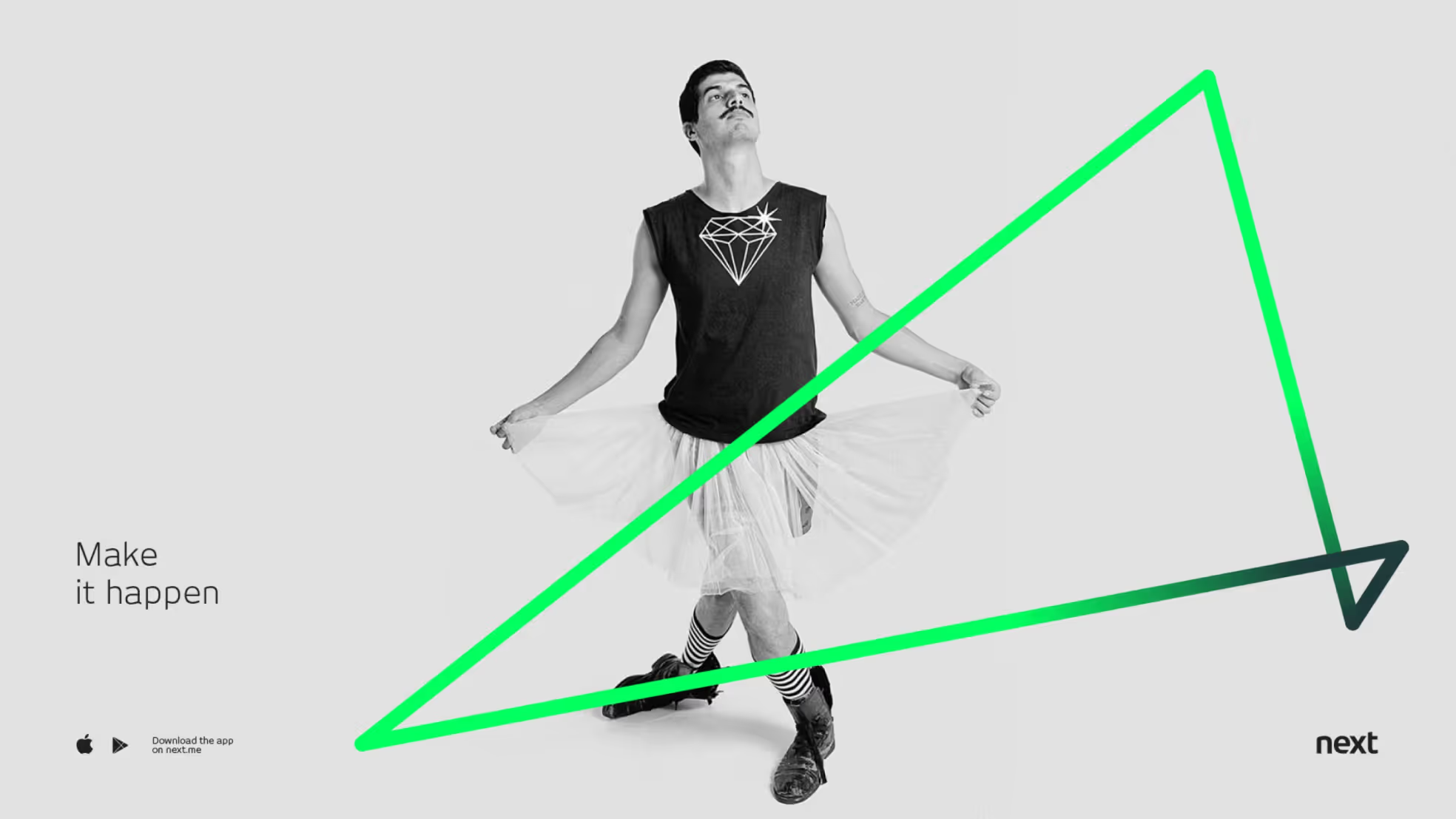
next
A bank that helps clients make better decisions while managing their money.

<first>T<first>he lack of financial education is a complex problem in Brazil. Research shows that a substantial part of the population is not used to managing expenses and saving money. In many ways, banks are part of the problem. With a menu full of complicated products, unnecessary fees and red tape for everyday tasks, financial institutions have lost their connection with clients.
next was a very ambitious project. Our team’s goal was to use technology and data to reinvent a bank from the ground-up. We wanted to help people make better decisions by simplifying money management. Instead of talking to clerks and managers at a physical branch, this new service could be accessed via a user-friendly mobile application.
Features
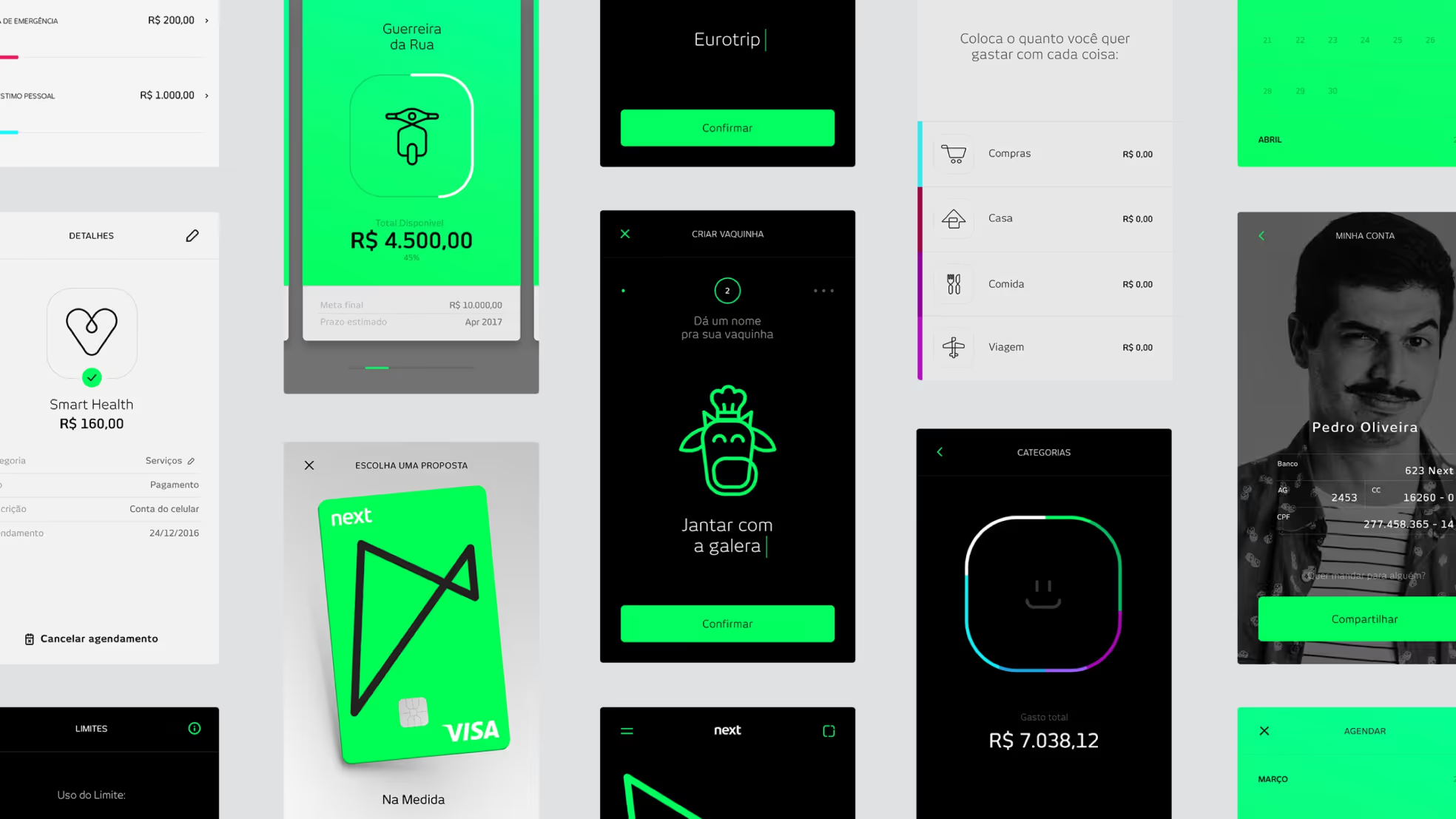
Flow
To define a budget, clients can use the “Flow” – an elastic shape similar to an hourglass. Flow makes it easy for clients to understand both how much they’ve spent that month and how much money is left. Each amount is represented by how large the shape is on each side of the hourglass.
Goals
Clients go through a step-by-step process to invest their money. For each goal, they can assign a name and icon. They can create multiple items, making it easier to separate goals. The app also recommends how much money should be saved every month.
Crowdfunding
Brazilians are social. They are used to crowdfunding for everyday things, like a picnic, a Mother’s Day gift or a stay at an Airbnb. So we created a crowdfunding tool integrated with the client’s checking account, making it easier to invite friends and manage contributions.
Online sign-up
At a traditional bank, clients have to go to a physical branch to open an account. That’s a step that many customers want to skip, so we designed an online experience that lets clients complete the entire process on a mobile phone. The flow is easy and secure, leaving behind the bureaucracy.
{{video-solo}}
The strategy phase
Managing people’s financial lives is a complex challenge. Any service that aims to solve that problem will have to deal with countless variables – such as profitability, technical feasibility, legal issues and security. During this project, our team interacted with hundreds of stakeholders on a daily basis. Participants came from different departments and professional backgrounds. It was a collective challenge, with granular points of view.
Furthermore, the fintech race is quickly developing and evolving, with many trends and possibilities. To create a relevant service for this industry, we needed good ideas and a clear focus.
We kicked off design development with three main questions in mind:
- How do we identify the best opportunities among the various trends?
- How do we map out the characteristics and needs of the clients?
- How do we use a common vocabulary for collaboration across multiple teams?
The first step of our process was the analysis of future trends. Our team reviewed the most important financial sector publications to understand the opportunities. We segmented our study into four areas: money management, wealth growth, accomplishments and everyday issues. Ultimately, we defined a unifying purpose for the project – proactivity. The team used this term as a compass for all decision-making.
Following that exercise, we described key principles for our creative process. We looked for ways in which design and technology could make life easier – from the perspective of a bank’s clients. Our inspiration was found in places beyond finance. Whatsapp, for instance, has a user-friendly sign-up process. What if opening a bank account were as simple as the Whatsapp flow? Through that lens, we collected multiple references to map out general design principles.
We understood that we needed to fulfill the needs of the business and the users. With a lean process, we defined four personas. Each of them related to an area of study defined previously – manage, grow, accomplish and solve. Our framework included demographic information, behavioral insights, points of pain and potential solutions. Over time, we were able to deepen the personas as we collected more data about the user base.
With a draft description of profiles and needs, we started brainstorming ideas. We used scenarios and illustrations at this stage to represent the routine of bank’s client. We dug deeper into their context before exploring the interface micro-elements. The bank could assist people in common issues. For example, customers could buy an iPhone in multiple installments or look for better interest rates than a savings account.
The strategic phase was a fundamental part of the project. Over that period, we built a shared vision among stakeholders, setting the stage for future problem-solving. It also allowed the whole team to agree on the scope and technical requirements. User journeys organized features and functions, such as money management or opening an account. As the final step, we divided the teams into groups to start interface design and development.
next is an example of how technology can be used creatively to simplify the relationship between people and their money. Traditional services provided by banks were revisited with a brand-new approach.
The creative phase
Designing a bank is more complicated than designing an ordinary service. A simple task – such as paying a bill – involves dozens of variations. At the same time, many design decisions are tied to technical issues and backend processes. That is the primary reason that the creative process for financial services is almost always slow. Our challenge was to overcome that inertia. In other words, we wanted to create a new bank from the ground up.
We considered the following questions during the creative phase:
- How do we use data in an innovative way?
- How do we receive constant feedback from the technical teams?
- How do we keep the design assets consistent?
We started by figuring out an easier way to track spending. Overall, the tools available for this task look similar. They just show lists and numbers. Along with the branding team, we explored different ways to enrich this representation, and came up with the concept of an hourglass. It’s a useful way to represent the notion of how much remains. If we could help people understand that in a simple way, the bank would become more relevant.
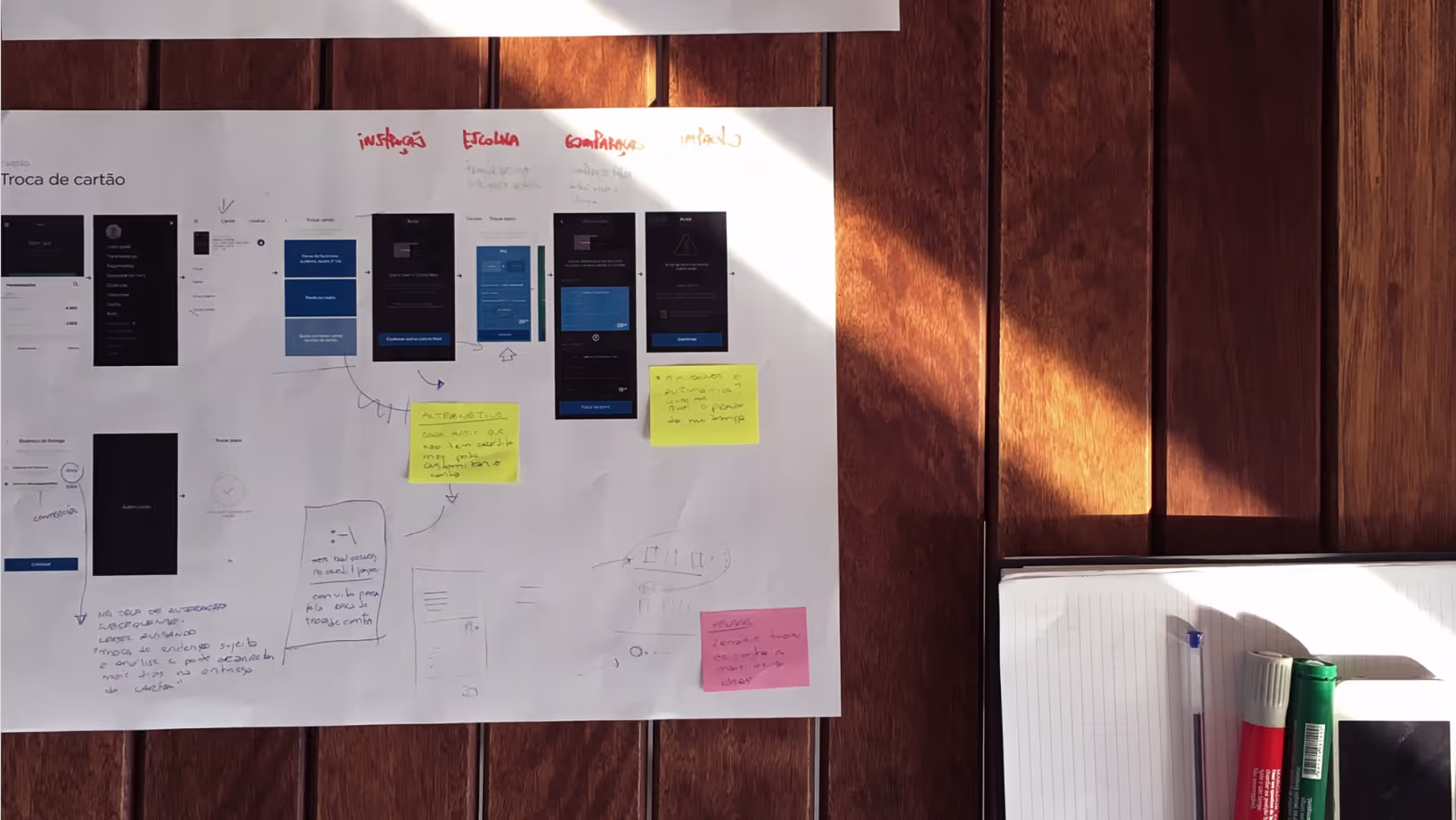
The next step was to design a flow for the most important functions of the bank. We tackled frequent actions, such as opening an account, browsing transactions and investing. Still, instead of trying to cover all the scenarios initially, we focused on the main flows.
We also came up with ideas to design traditional processes in a different way. Every bank has a way of investing money, but the reason why people invest may differ from client to client. Someone may be saving money to visit relatives in Italy, for example.
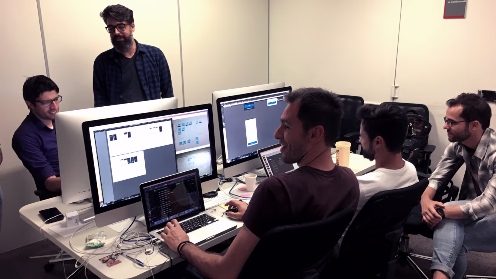
While we were designing the interface, we used prototypes to facilitate internal communication. The simplest formats were static images with links for cross-navigation. They were easily shared and protected with credentials. At that stage, the cooperation between the design and technical teams was crucial. If we had used complex formats for the prototypes – making them hard to handle – it would have been more difficult to get everyone involved.
In addition to bringing teams together, the prototypes allowed us to run quick user tests. For example, we analyzed the process for sending documents and filling out forms via cell phone when opening an account. The tests allowed us to discover any limitations in our designs early on. The feedback was helpful to justify design decisions across different departments as well. The user’s perspective can be a great asset when challenging the status quo.
After tackling the most important flows, we had a reasonable number of screens. Then, we reviewed our work to identify design patterns and templates. This predefined system allowed us to tap into edge cases with confidence. Variations and obscure scenarios for each function were then detailed. The templates helped us manage the work across multiple teams, without compromising the consistency of our designs.
<heading-light>Visit the<heading-light> next website
My role
I worked on this project between April 2015 and January 2017 at R/GA in São Paulo. My main activities were:
Strategy
Collaborated with the planning team to define a vision for the project and led the UX team while designing strategy deliverables.
Creative
Collaborated with the design and technology teams during the early stages of the concepting phase; led the UX team while designing the interface and prototypes; collaborated with product management, planning, design, copywriting and technology during the development phase; organized and performed user tests.
Management
Interacted with senior stakeholders on a daily basis; led executive presentations with C-suite executives; coordinated creative teams in the War Room.
Results
Nota na App Store
45% vs 25%
Inserção de categorias de mercado*
65% vs 40%
Add-to-cart*
These were the main results for the first 6 months after launch:
1.3mm downloads
to open an account
94%
of downloads came from the demographic target (high-income millennials)
129k
active clients, growing 40% per month
557k
waiting for approval to open account
30%
of clients created a goal to save money
2%
of inactivity (market average is 24%)
Awards
Cannes Lions
The Eye of Iberoamerica
D&AD
Wave Festival
The One Show
Art Directors Club
MidasAwards
Access the full list of awards on my Linkedin profile